Operational interfaces · Selected work
The screens people sit in front of all day.
Dashboards for merchants, car dealers, workshops and clinics. Different products, different years, different clients. All of them built for someone doing a job, not someone browsing.
These are working screens pulled from several products over several years, so the visual styles do not match. What they have in common is the type of problem. Three of those problems come up in every operational tool I have built, and they are the reason this page exists.
01 · Two directions, one product
An Arabic dashboard is not a flipped English one.
These two screens are the same product. One in English, one in Arabic. Flipping the layout is the easy part and takes an afternoon.
The work is everywhere else. Numbers and currency stay left to right inside a right to left sentence. Charts have to be read from the correct side, so the timeline reverses but the growth line still has to feel like progress. Icons that imply direction have to be redrawn, not mirrored. Table columns reorder by importance, because the eye now enters from the other edge.
Most teams discover this after launch, when Arabic users say the screen feels wrong and nobody can explain why.
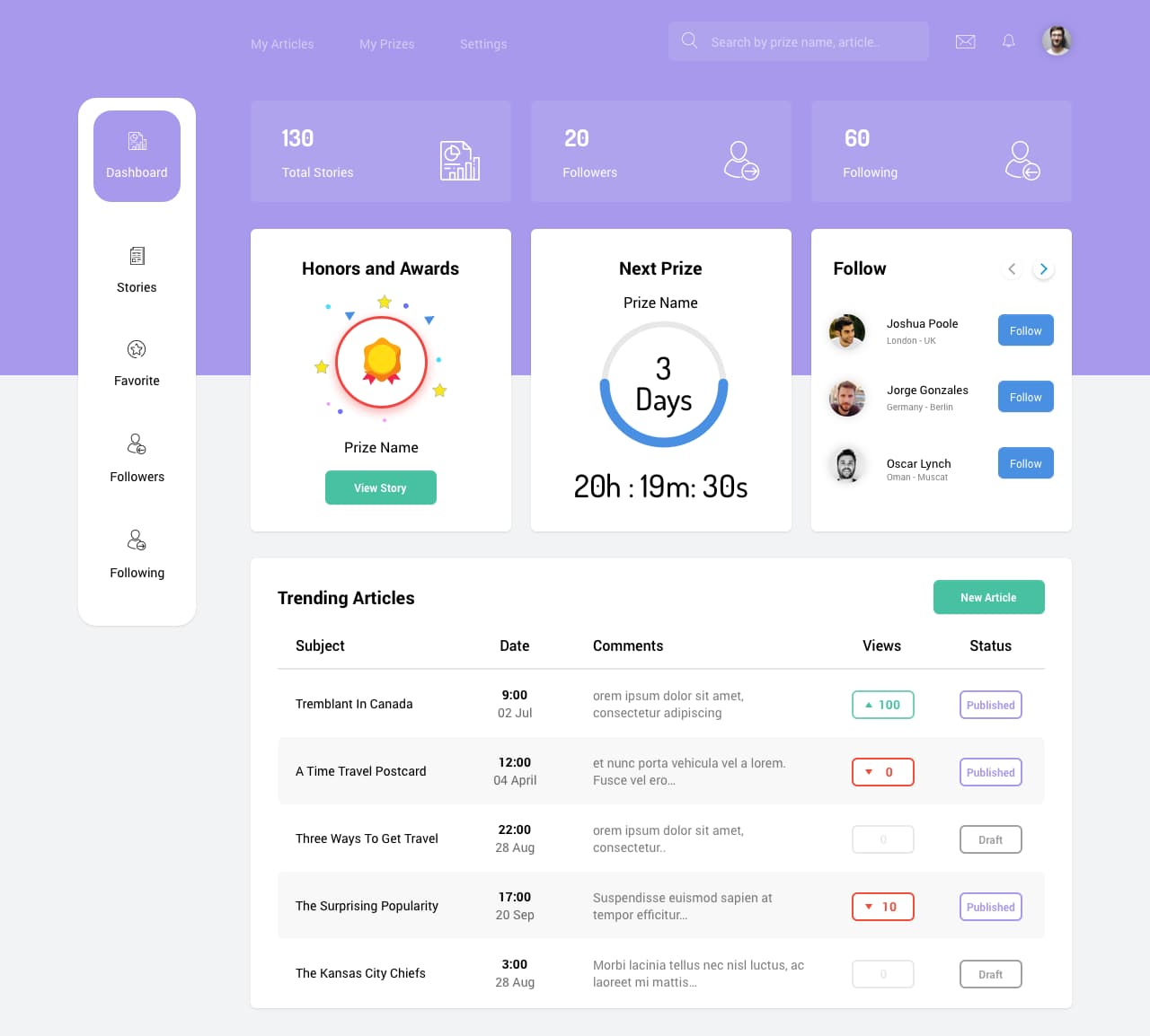
English. Navigation left, table reads left to right.
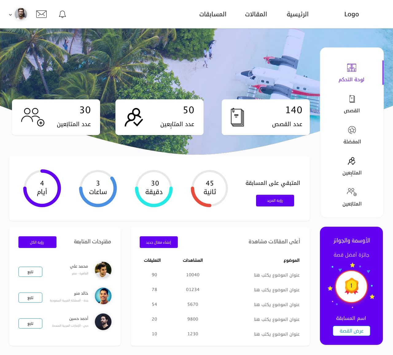
Arabic. Navigation right, counters reversed, numbers still read left to right.
02 · Day one
Every dashboard launches empty.
Portfolios show dashboards full of data. Real users see the empty version first, on the day they sign up, before they have decided whether this software is worth their time.
That screen has the hardest job in the whole product. It has to keep the layout it will have later, so nothing jumps when data arrives. It has to say what goes in each box, so the emptiness reads as new rather than broken. And it has to make one action obvious, because a new user does not need six options, they need the first one.
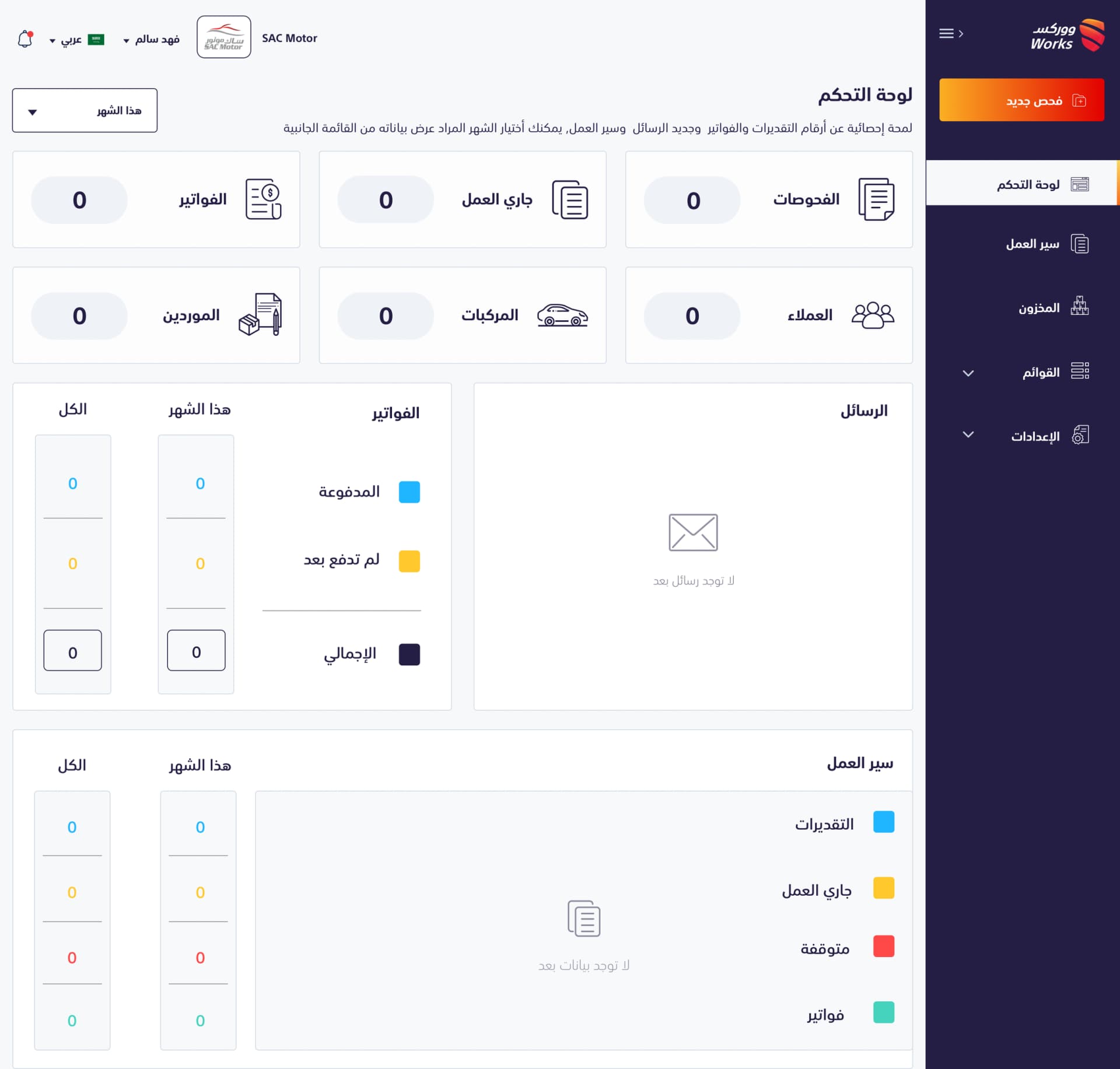
A workshop management dashboard on day one. Every counter is zero, every section keeps its final shape, and one orange button is the only thing asking to be pressed.
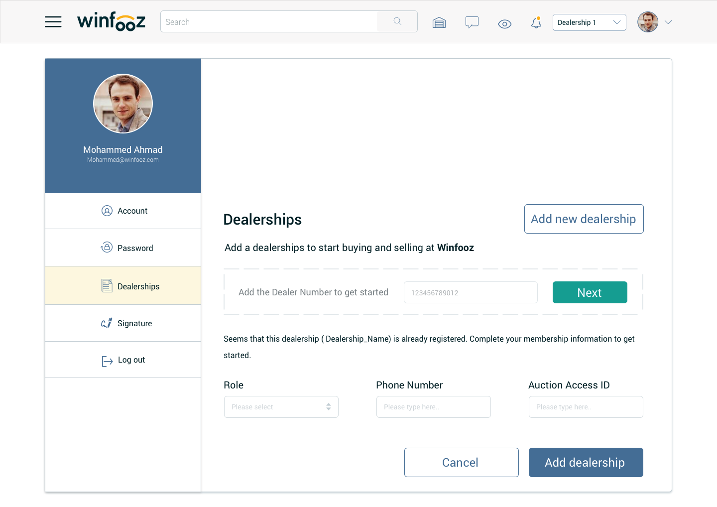
A dealer joining a car auction platform. One field to start, and the rest of the form appears only after the system recognises the dealership.
03 · Density
Business owners want everything on one screen.
They are not wrong. A merchant checking the shop between customers has about ten seconds. Making them click through five tabs to assemble a picture in their head is worse than a crowded screen.
So the answer is not less information. It is rank. Money first, because that is the question being asked. Then the trend, so the number has a direction. Then the list of things that need a decision today. Everything below that can wait, and everything with no decision attached can leave the page entirely.
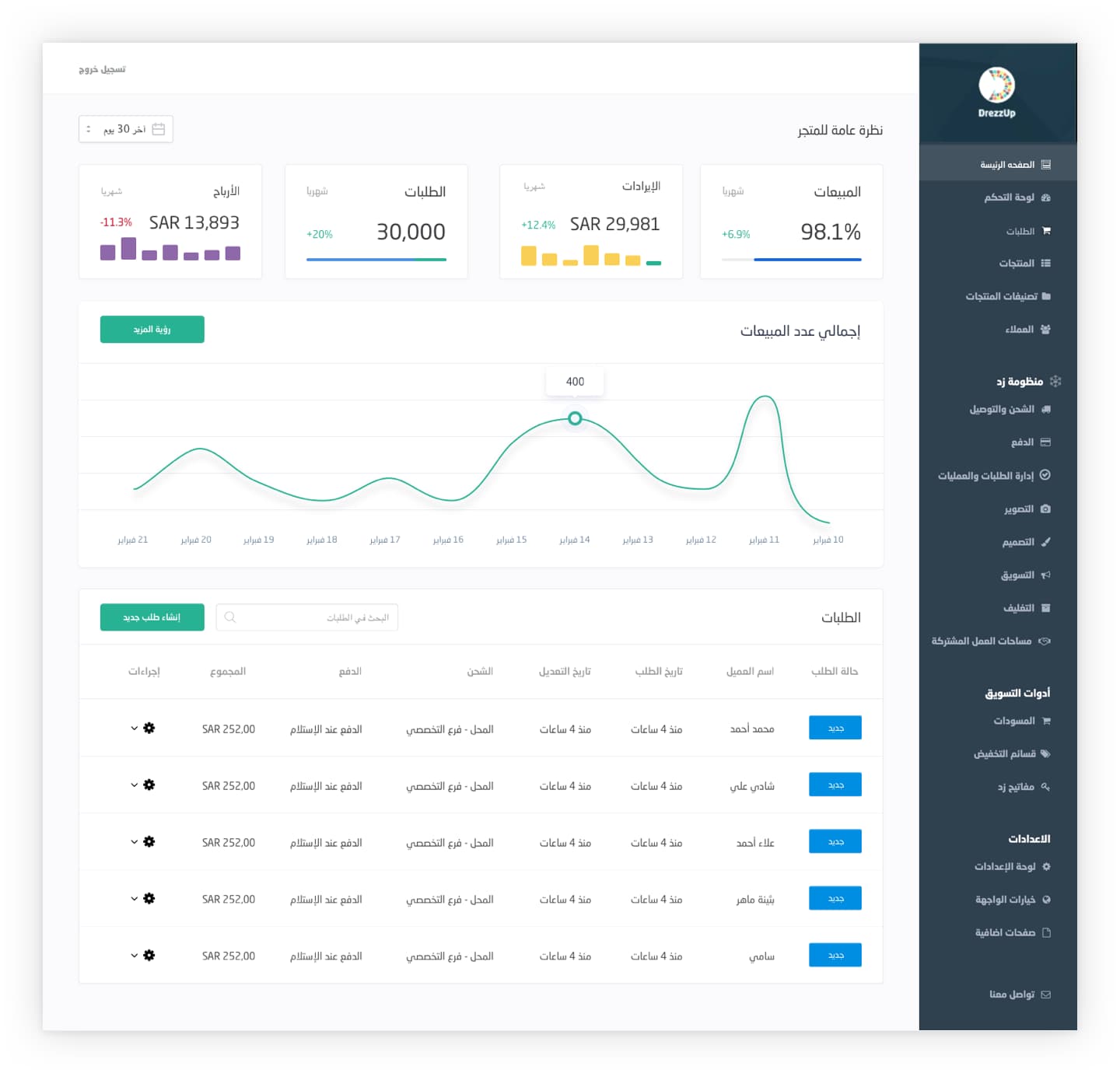
An Arabic store dashboard. Four money figures with their own direction, one trend line underneath, then the orders that actually need action. The long settings list stays on the right, available but quiet.
Why this matters now
The same three problems, with a model attached.
- Arabic is still an afterthought in most AI productsRight to left layout, Arabic numerals, and Arabic text generated at unpredictable lengths break more interfaces than anyone plans for. I have shipped this in production, not just in Figma.
- Empty states are now cold startsA product with no data yet is the same design problem as a model with no context yet. Both have to be useful before they are informed.
- Density is now confidenceRanking information by what the user must decide today is exactly the skill needed when a model produces more output than anyone can read.
These screens come from client work across several companies and years, shown here as craft rather than as case studies. The full stories, with the decisions and the constraints behind them, are on the individual project pages.
Need a dense screen to feel simple?
That is most of what I do. Complex, regulated, often Arabic first.
Start a conversation